Semester Two
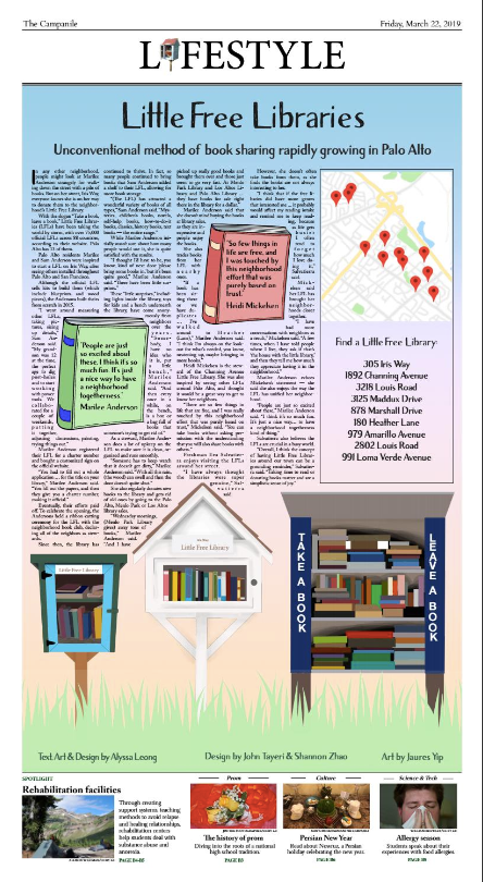
Initially, I didn't sign up for my story about Little Free Libraries (LFLs) to be a design page. However, I'm very happy with how it turned out! From the beginning, I knew that I wanted graphics of some of the real LFLs that I mentioned in the article. Since LFLs are neighborhood initiatives, we wanted to convey a feeling of friendliness and whimsy. My page partners came up with the idea of adding grass and books as pull quotes. The background gradient came from an older design page, and I love the eye-catching rainbow color. I designed the map based on the map on the LFL website of all the registered locations. I think it's an interesting design element and it's somewhat interactive with the reader. We had difficulty agreeing with the theeds on a good font to use; however, I'm happy with the one that we ended up using, as it conveys a bit of the playfulness of LFLs without being overly cute. Overall, I loved how this page turned out (and so did my sources)!
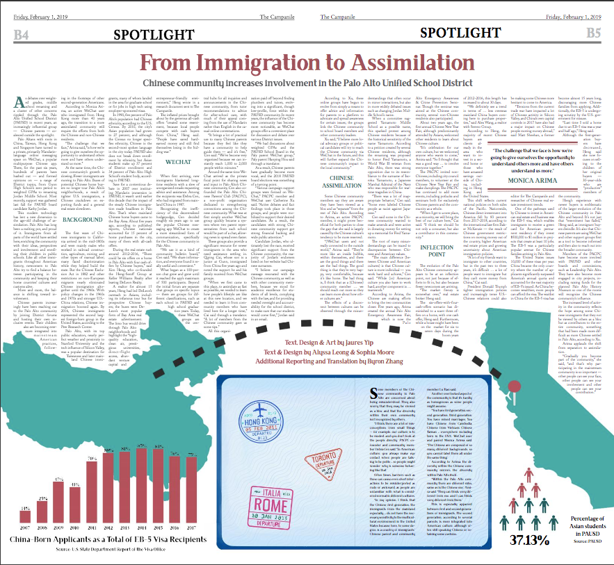
Since we were working on the actual article for most of production, our design for this page was admittedly pretty last minute. I came up with the idea to do the countries on either side connected by a dashed line. I like how it represents both the separation and connection between the two places. I also created the chart and the infographic for this page. While I'm pretty satisfied with how this came out given the amount of time we spent working on it, I wish there could've been some more design elements higher up in the page to break up the text a bit.
Semester One

For this page, my partner was on Spotlight, so I ended up designing it by myself. While I was initially daunted by this, I am proud of how it turned out in the end, and it was an enjoyable experience. I took the color scheme from the colors from the graphics of the compost and recycling, so that it would be equally spread throughout the page. The original design used 4 sections with 4 different graphics as headers. After feedback from the theeds, I changed it to 3 sections with the text going into the different bins, and used the fourth graphic (the apple cores) in the corners of the pull quotes, which added contrast to the cooler color scheme. This was the first page I’ve designed by myself, and overall I was proud of the end result considering the individual work I did on it.
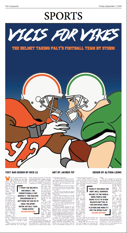
For this story, my partner and I purposely kept the design simple to highlight the artwork. One feature of the helmets was when a player wearing it tackled/ head-butted another player, the shape of the helmet would change to account for the shape of their head. While we initially planned to show this in the art, it ended up being too difficult to draw. However, we still felt it would look better to highlight the art on its own, as opposed to text wrapping it, which also made sense considering the shorter length of the article. We added a blue gradient in the background to add some contrast (as solid dark blue was too dark) and used orange as a contrasting color.